If this is the first law of good design and engineering, then many watchmakers are as guilty as O.J.
Being able to tell the time is not an ability we are born with. Most of us still remember the time when we learnt how to tell it! Yes, we needed someone to teach us how to do it - and to explain to us the meaning of hours, minutes, division of time and relation between the short hand, long hand and twelve numbers. Very quickly we realized that time telling is all about the relative position of clock hands and we were able to 'tell the time' without even understanding how the clock works or how the time flies.
Very quickly, the link between the position of hands and the actual time created a series of mental images deeply 'stored' in our subconscious. Soon, we no longer needed to 'see' the actual numbers or even the minute track because the mere position of two hands was sufficient for very precise time telling.
The link created was a very powerful one - so powerful that with the introduction of digital watches, most watch owners quickly realized that while 9:37 was an accurate time reading, the information was lacking mental picture of "9:37".
The position of hands on an 'old' clock dial was far more meaningful - it provided more complex information (not only the current time but also the relation between the current time AND some future / past time without any conscious calculation).
In other words, we knew how to tell the time because we were recognizing 'pictures'. On the contrary, LED watches provided no pictures, just a row of numbers which needed conscious effort of translation and calculation.
Very soon, the watch manufacturers realized that something was 'wrong' and what followed was a generation of digital watches which featured both analog (hands) and numerical display.
If there is one area which best portrays the stubbornness of the human race, then that has to be the area dealing with design of digital watches.
Refusing to accept the 'normal', some designers went into a great deal of trouble to create even more bizarre watches which required even more mental effort to read.
Take this one for example:
If this is not slow enough, then here is another 'clever' design:
the LCD Maze Holographic timepiece:
Now, if you really MUST have a digital graphic-display watch then here is one which probably makes more sense than others and requires far less mental effort for our 'pre-digital era' brains:
At least, the designer was honest enough to recognize one simple fact: that more means larger 'pile'. Based on that simple concept, here is the watch:
So how long did it take you to figure out the time on this baby? Less than 5 seconds? A minute? (That was our office average :-)
As said before, displaying time-related information on the watch dial in a meaningful way is both a conceptual and technical challenge.
For that very reason, from the earliest days of horology, watchmakers have spent years perfecting a seemingly trivial functions.
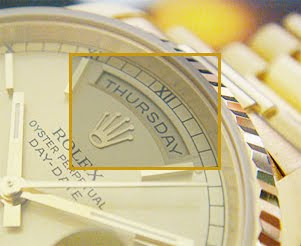
Here is one example of such an effort: day of the week display.
From a mechanical point, the simplest day display would involve a simple pointer which will 'point' to the current day. The drawback of such a design is a relatively cluttered dial which is not aesthetically pleasing.
However this display lacks one important information: it no longer places the current day in relation to other days of the week. In other words, Thursday - or Sunday - is just another day in the week, not a particular day in weekly cycle.
Here is the third design which is not only more intricate, but also mechanically challenging: retrogrades.
Retrogrades means "reverting to an earlier position".
Such a display combines all desirable aspects, it is 'true' to watchmaking tradition of skilled makers and places each day in an un-mistakable weekly cycle which then repeats itself in the way we are used to.
In addition, note the perfect silver guilloche dial, delicate print, blued steel hand and the exquisite white gold hour markers - all housed in a timeless tonneau shaped case.
A true watch aficionado and keen student of horology should base his watch choice upon those features, not exclusively on a brand name or price.
By the way, I am sure you have noticed how the watchmaker placed the pointer EXACTLY in the middle of the letter U. Attention to detail, of course!

No comments:
Post a Comment